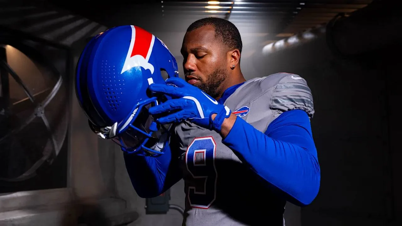

The Buffalo Bills have introduced new ‘Nickel City’ alternate uniforms, an all-grey pant and jersey combination, ahead of the upcoming season. These new uniforms are designed to pay tribute to Buffalo’s industrial heritage and the hard-working individuals of Western New York. The unveiling coincides with the inaugural season of the new Highmark Stadium.
The all-grey design draws inspiration from Buffalo’s historic steel mills, grain elevators, and rail yards. The uniform also features a blue collar, intended to honour the workers of both past and present who embody the city’s strength, work ethic, and authenticity. This aesthetic choice connects the team’s appearance with Buffalo’s blue-collar, industrial history.
Design and Inspiration
The ‘Nickel City’ theme for the uniforms is a nod to the city of Buffalo itself, specifically inspired by the Buffalo Nickel. Aaron La Porta, the Bills’ director of design, noted that when creating alternate uniforms, NFL clubs are required to use colours already present in their existing palette. Grey was a brand colour the team had not previously emphasized, presenting a unique design challenge.
A prominent feature of the new uniform set is ‘The Charge’ helmet. This helmet boasts an all-blue base with the iconic red charge. The design brings the Charging Buffalo to life, showcasing its signature horn, eye, and charge streak on a royal blue shell. The helmet also incorporates a metallic flake finish and additional metallic blue flake accents, aiming to convey a sense of energy, strength, and attack.

La Porta described the new helmet as a “bold new helmet to represent a bold new era in Buffalo Bills football.” He and the Bills design team were also involved in creating Buffalo’s ‘Cold Front’ Rivalries jerseys, which first appeared in 2025. This prior experience provided insight into the complexities of designing a complete uniform set while maintaining the team’s core identity.
The design process for the ‘Nickel City’ uniforms spanned eight months. It involved careful selection of fabric colours, helmet paint finishes, and broadcast television tests. The team worked within specific guidelines regarding what could and could not be adjusted or introduced into their brand and uniform collection.
Uniform Details and Debut
Instead of the usual ‘BILLS’ or ‘BUFFALO’ wordmark beneath the collar, these new uniforms feature a Bills logo patch on the left chest. This placement is intended to symbolize a connection between the team and its fanbase. The numbers and player names use the same typefont and weight as the standard uniforms, but with a new colour arrangement: blue block numbers are outlined in red and white, while player names are emblazoned in white across the rear nameplate.
The all-grey garb replaces the team’s previous alternate uniform, the all-white ‘Cold Front’ jerseys. The ‘Cold Front’ jerseys were worn during a Sunday Night Football matchup against the rival New England Patriots. The ‘Cold Front’ kit was part of the NFL‘s and Nike‘s Rivalries initiative in 2025, and was among the more popular sets.
The Bills are permitted by the NFL to wear their alternate uniforms for both home and away games. However, the team has not yet announced the specific games for which the ‘Nickel City’ uniforms will be worn. La Porta emphasized the team’s commitment to elevating the Buffalo Bills brand and engaging more fans, while also honouring the region’s history and legacy.
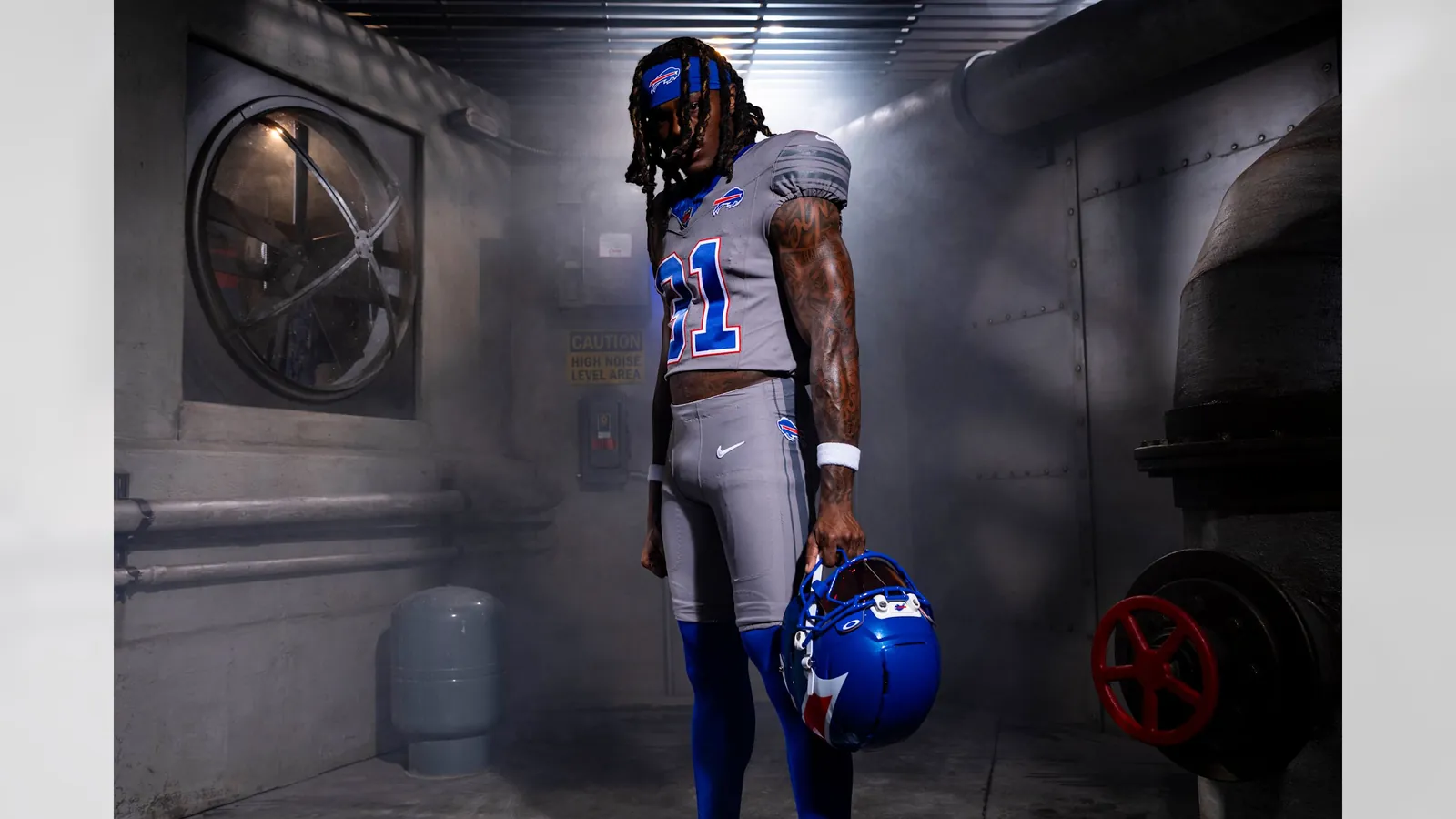
The introduction of these new uniforms marks a new era for the Buffalo Bills, coinciding with the opening of their new stadium. The team aims to connect its on-field appearance with the community’s identity through this thoughtful design.
Source: sportsnet.ca

As CasinoNews's Sports News Writer, Mason Leclair reports on the CFL, golf and combat sports for readers across the country. He moved from regional papers into digital sport. He holds a degree in Journalism from Carleton University. Mason lives in Ottawa, where he follows the PGA Tour and mixed martial arts. “Get the facts down first, then add the context.”